Website Breakdown - LB Entertainment - Great Images, Interesting Design Elements, Incorporate Calls-to-Action, a Blog and Cross-Linking
Small Business and Local Nonprofit Website Tips and Suggestions
LB Entertainment presents a unique challenge for our website breakdown video. In most cases, local businesses lack content and quality images while LB Entertainment has more than enough.
Here we look at streamlining how users navigate the site, adding calls-to-action and more consistent design elements, and improvements for search engine optimization and conversion.
Given the LB Entertainment's interest in SEO, our recent blog post about Keywords and the use of Content Clusters to rank better is worth a look.
Video Transcription
Brian Ostrovsky here with another website breakdown video. In this case, we're gonna have a little focus on SEO (search engine optimization).
This came to me from a friend from high school actually who asked me to critique her husband's website.
So, as I dig into this, I want to say that there's a lot of things going on here that I like. There's a lot of very cool design elements there's definitely more content than we tend to see from most local sites so all of that are very positive things.
What I want to focus on, though, is structure.
As we go through this there's a lot of inconsistent design elements, now they're all cool there's different and there's not necessarily a reason for that. But, there's also the need for structure in terms of how you structure the experience from one page to the next, the natural process of discovering content from your navigation to within the page, and keep in mind that when people are on your website you need to cater to three levels of engagement.
Making Content Easy to Find, Scan, and - ultimately - Read
The first is, how do I quickly find information?
- Who are you?
- Where are you?
- What do you do?
- How do I get in touch with you?
- and, maybe, how much does it cost?
Once people can quickly find that, then you also want to provide information that's scannable.
All right, I see you provide a photo booth, you know what am I looking for? And then when they're ready to consume information make it readable and that's where you have a little meatier text.
The other thing around SEO is, you know, Google approaches SEO or search results as saying look some does a search they have a problem. And Google wants to provide the solution.
So, what are people searching for and why are they searching? What is their problem they're trying to solve? Then you need to have content that solves that problem.
Now if you can use keywords that are closer to the things they might type into Google that's a good thing. But the sentiment is, what's the problem I'm trying to solve and that is your content that does that?
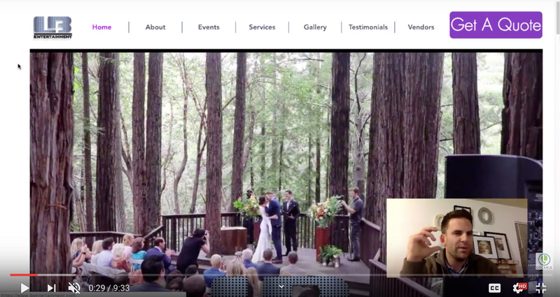
So without preamble out of the way, I'm gonna start by saying this has a an auto running video on the page. Which, I'm not a big fan Auto running video.
Video is great but I don't like it automatically happening and, in this case, before I started shooting the video the website crashed my browser. So I think there's some video other things happening here that are making the site heavy and problematic.
The bigger issue though on the homepage is there should always be a "welcoming message" with a values proposition or a value statement. And while the video is cool and there's this big block of text it's not really a value statement.
It's not until you get further down, below another video, that it starts to feel like a "welcome."
Usually we say don't say welcome, be welcoming.
So, in general, this should be be higher up. Although, I would break it up. You don't want a wall of text.
Pull out a few elements and put that in your header or sub head and then have text below that.
But it should be less.
These videos could be great I would just put them in lesser places on the site or strategic places and let people click to play them.
Also, a note on video, from an SEO perspective YouTube's gonna be your best bet.
Upload it to YouTube, embed it on your site, Google loves it, plus people can find you on YouTube.
To a lesser extent, you might want to use Wistia or Vimeo, do not use the built-in stuff on web service providers like Wix - which is what it looks like you're using. It's just not gonna perform as well and you don't get any other other benefits.
I love seeing that you reference clients and then you've got a bunch of great pictures down at the bottom which are cool. Probably just a little candy more than anything.
So, as we go through the navigation, there's good stuff here but I don't feel like it has a flow in terms of what are people looking for. Maybe I'm wrong but it feels like there could be a little more structure to that.
Use Calls-to-Action to let people self-select their path
And I'd like to see that instead of these items being on the page, maybe use columns in a different way. Have calls to action to be able to choose your own adventure. You know events or rentals or professional services or whatever you'd call that.
And so as I come up here and I look at your About pages, you know I love that you have about information for the business and for you as a DJ.
I would say again less of blocks of text. Break it up, add some formatting. Headers, bold, italics, well maybe bullet points that sort of thing. The same is true on the DJ page. Here as well, don't worry about it lining up perfectly. If it has to break down, it breaks down.
There's a lot of stuff here that looks like it could be bulleted and formatted to make its scannable and all of that.
Cross-linking within your own website
As I go through the site one of the things I noticed is that there's not a lot of in page links.
This is a missed opportunity to relate to other things because a lot of these services overlap and so you should link back and forth within the page.
What you don't want is a cul-de-sac. Someone comes in, they go, and then they're done.
That's a little bit what's happening here. There's no links and there's no big call to action within the page.
There is in the footer but that's sort of in the noise section so definitely work in calls to action.
Again don't use full width as well because your eye doesn't want to travel. So you may want to do columns here or do what you did on the About pages where you have text on one side picture on the other... 50/50 70/30. You know that sort of thing.
So the lighting design page, obviously a lot of stunning images here. Similar issue as the previous page although I do like that you have these services bulleted.
Although, again, if you could link back and forth that's great. You have some images here keep in mind there is no hover on mobile... So what happens, is it supposed to be there? I don't know, anyways, it's a neat effect but it might not play on mobile at which case that's a bummer.
Then you have this video that's also on the home page. Anywhere you have an asset, a graphical asset or a video add some text. Google can see it, people can see it, it adds context before I invest in playing this video.
I'd challenge you to think about, okay does all of this add value? I mean there's eye candy here but at what point is it just taking up space?
You know, are people really going to look through all these pictures? Maybe, but if you gave them some context for that where you said 'here's what's going on here, and then here's what's going on here' and you walk them through. Then they understand.
That looks like a laser beam to me, which is cool, but you know is there value?
Design Consistency is important
So, as I keep going here to other pages, what I start to see is a number of very different design paradigms.
Now this is a video on loop, we've talked about videos. Now we've got this sort of offset thing here, which is again it's cool it's just a different design paradigm.
We have another gallery. So pick a few things that you like and just stick with it.
It's jarring when you view different things throughout the page.
This one I actually think it's simple and nice. I would break this up and your call-to-actions way too subtle. People are lazy and blind - hit them in the face with it.
In this case, I would say link them to your quote page or to a contact page. Don't have them call you from this page and you have your email exposed which means spambots can actually get it and send you spam like crazy. Even though it's convenient, you probably want to link this to a contact page where people fill out a form and spam bots can get you.
This is a really cool service that I like, rustic furniture, I think that's really cool.
I like this this layout but again is another design paradigm. I would simplify I like the page here again call-to-action is buried. Call it out, make it big and bold, a button and colors, and all sorts of stuff.
Again, cross link within your site and help people see how these things fit together as a package not merely a whole bunch of pieces. You don't buy Legos by the piece, you buy it in the box and you see the pieces and how it gets built together.
So think of your site think of your content that way. And on that note, a blog is really missing.
Blog, I know people don't like the word blog, I don't like it either, but ongoing fresh content is critical for SEO. Frankly, it should be the thing that feeds all your social media. You're probably already posting stuff to your social channels... it should live on your site.
Beef it up, post your site, share it, link back to get people coming to you and that will drive a lot more SEO, and, frankly a lot more traffic.
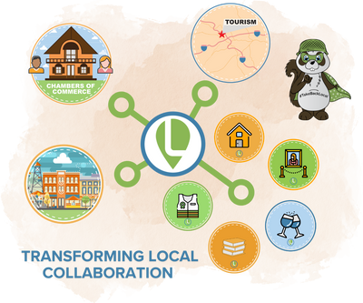
I'm going to wrap up on the vendors page. I love that you're promoting all the places that you've done venue work and their vendors. Cross-promoting great, it's part of the community. This is a little plug for local but you know our free Local Connections tool could work here, you can highlight on all of these folks, you could add a community calendar. You could ask them to reciprocate and promote you back so that can help you reach more people and authentic way.
It's great to see that you're you're showing them some love.
Then throughout, I would sprinkle in some testimonials. You have testimonials here that you're pulling in from Yelp but mix them in on pages for context. Of course, you can collect testimonials outside of Yelp if you want to use those as well.
So with my preamble done and running through this, simplify your navigation, make it easier for people to choose your own adventure, pick fewer design options, add some formatting, add some links, and add a blog and those things will help you get a lot further on the SEO front hope that helps.