Website Breakdown - Dedicated Moving Billerica MA, Clarifying Value and Service, Better Pictures & Website Structure to Rank & Convert - Video
Website Content & Structure Suggestions to improve SEO and Lead Generation
Dedicated Moving of Billerica, MA is looking to update their website to help drive more leads - this really means, get more people to their site and then convert those who visit into leads. Their site is overly minimalist with some unusual structure - both of the content and the linking / navigation.
Interestingly, their Facebook page - specifically the About section and their Story - do a better job of quickly communicating value.
It's important to remember that people need to be able to progress through your site, think about why people visit you and then setup a path based on questions or concerns they may have.
Here we look at a number of ways they can improve the structure of the site and incorporate more content to grow engagement and drive leads.
- Marketing 3-4-5™ to simplify local marketing and become more effective
- Why blogging is important - and why we hate the word 'blog'
- The optimized way to create, post and distribute content online
- Download the content marketing guide & social media checklist
- And the site shouldn't feel slow like it lags, that will hurt you.
Involved in the community or support other local businesses?
Be sure to check out our free Local Connections™ technology to automate cross-promotion and collaboration.
Want Locable to help you improve your website to reach more people and convert more visitors?
Let our technology and expertise be your guide.
Video Transcript
Hello again, Brian Ostrovsky here with another website breakdown video and today we're gonna look at Dedicated Moving's website.
This was in a Facebook group that we're a part of where they were looking for ways to generate more leads and so I wanted to run through some of the things that we see when we look at their site.
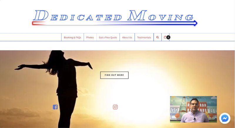
So, first and foremost, it is mobile optimized, it's built on WordPress, it has a lot of that bones in place but the first thing that strikes me is that there's no welcoming message.
There's no statement of value or values.
This is dedicated, I presume, they make moving easier so why not add your tagline. Add something to help someone who showed up here get a sense... okay, is this personal moving for residential, is it commercial, it's both.
Really helping someone understand why they're here in the first place would be quite useful instead what we have is find out more... find out more about what?
Calls to action are good but people need context we also have the social links here which are fine but not really necessary in the body. You can put it up in the top and there's a chat option here using Facebook Messenger which I like but, you know, again it's not useful in this case until I care.
Licensed and insured is probably a good thing to put on your site but not necessarily the reason I'm going to call you now so again the context is out of alignment.
Having more information about where you're located, what areas you serve, just previewing that here would be great because, remember, some people browse through navigation and some people browse by scrolling and clicking and you want to play to both so you'd really want to have some of that information about booking maybe some information.
I don't know why I need photos I'll look at that in a minute and then maybe the big call-to-action to get a free quote down here? So, redundancy is good... redundancy is good. And so having some of those redundant elements can be useful.
So let's take a look at bookings and FAQ.
Well, the site is a little slow which is kind of a bummer but not terribly slow.
When we get down here again we have now a little more context and it's great to see customer reviews but I'd like to see more information about you know here's what we do, here's how we come to you, some text.
Remember that text is what Google reads which is going to help you rank on Google, the more you rank on Google, the more people find your site, the more leads you're gonna generate.
Having this information is really great. Photos, again, I don't know that photo sare useful in this information or in this context here. And then some of this just it doesn't feel like this is meant for this type of service these might be useful links but the way it's structured is a little confusing. But then the ability to book is useful.
I'd ask how often people tend to book through self-service versus calling you. I'm not sure if this is a self-service type of industry. If it's not, I'd focus much more on that and make the text much bigger
So, kind of a layout issue restructuring this making it easier to read, bigger text, all of that sort of thing. As for photos, let's take a look at that it.
It looks like these photos are being pulled in from social media, I'm not sure this adds a lot of value. Maybe you put it in the footer of every page if you really want to highlight it but I would definitely encourage you using more pictures throughout the site.
Ideally, authentic pictures. Pictures of you on your truck, pictures of you / your guys carrying boxes, you know, doing the things that you do.
The stock image in the background is confusing.
This is a case where having this information again is it really useful but expand it out why is licensed and insured matter why does that matter to me as a potential client.
How are you licensed? Up to what amount? What does it cover?
Oh, you can do assembly and hookup so what are some examples?
Importance of blogging & content
So, this is when we're getting to the next level stuff so let's talk about blogging. If you blog about success stories: here's where we set up the home entertainment center, here's where we moved a family that was moving across country or whatever, and that starts to reiterate the content of your pages.
This, again, helps you have more content to share to social media and to rank on Google and email. All of the things that we talk about in Marketing 3-4-5™.
So I like seeing your picture here, I'd like to see more of you. Glad to see you have a bio here.
The organization of this site could use some, some tightening up a bit and then it looks like some of the navigation changes depending on which page were on... and I'm not sure that that is a useful difference there
That what we do link actually goes to the same page as movers. What you do is important, pull it out, put on the home page more.
And then, again, featured testimonials throughout this site not just on one page ... although in this case, it looks like that's not sure so it looks like this might be a slight work in progress but there's some opportunity to make it more human-friendly and thereby more Google friendly.
While having more tex that moves people through what do they need to know, what steps do they need to take, what questions do you answer on the phone when they call. If all of these things are things at your site then you can start to address.
I hope that's been helpful and hopefully, it helps you attract and serve more customers.